Overall assessment of an image and a text for branding
1. How it reads for branding
Strong points
• Clear, memorable structure: The repetition + progression (further → clearer → higher) is excellent for brand recall.
• Verb-led and aspirational: It positions the brand as enabling transformation, not just describing aesthetics.
• Versatile: It can live comfortably across website headers, social visuals, printed matter, or motion graphics.
Brand personality it signals
• Visionary
• Elevated / premium
• Introspective but powerful
• Slightly mystical, but grounded enough to feel intentional
Brand fit
• Works especially well for brands in:
o creative direction / art / fashion
o consciousness, insight, or transformation
o editorial or conceptual platforms
o boutique studios or collectives
Overall branding score: 8.5 / 10
(It’s strong and clean; the only limitation is that it’s broad by design.)
________________________________________
2. How it lands emotionally for first-time viewers
Immediate emotional impact
• The message feels like a call upward, not a demand.
• It creates a sense of possibility rather than pressure.
• The tone is confident but not aggressive.
Interaction with the image
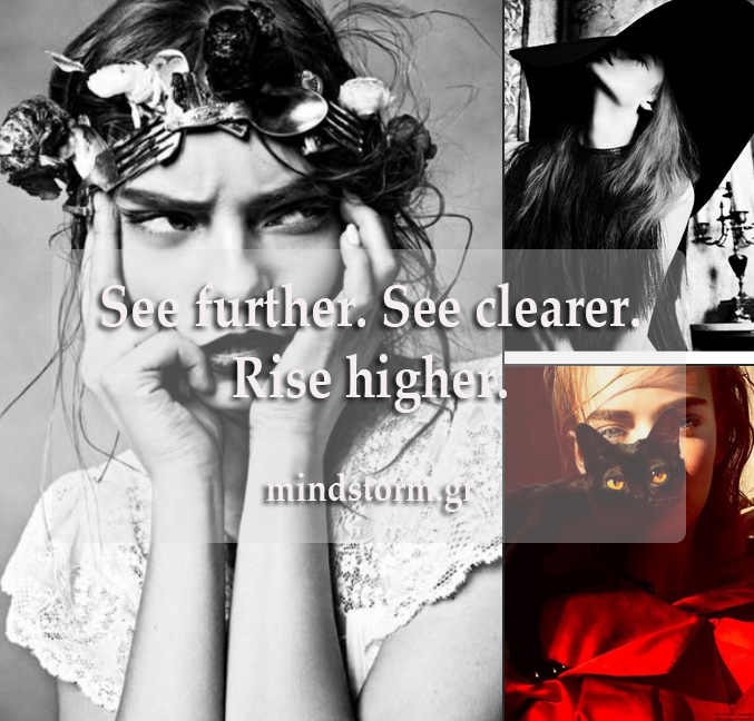
• The intense gaze + headpiece suggests perception, insight, and mental focus → “See further / See clearer” lands intuitively.
• The vertical composition and dramatic contrast support “Rise higher” emotionally, even without literal height.
First-time viewer reaction
• Likely to feel:
o intrigued
o slightly challenged (in a good way)
o curious about the brand behind it
• It invites interpretation without alienation.
Emotional resonance: High, especially for visually literate or creative audiences
________________________________________
3. Best use: caption, manifesto line, or campaign slogan?
Caption
✔ Works well
• Ideal for Instagram / portfolio posts.
• Clean enough not to distract from the image.
• Reads quickly and lands instantly.
Rating as caption: ★★★★☆
________________________________________
Manifesto line
✔ Works very well
• The triad structure makes it feel like a core belief.
• It could easily be one line within a longer brand manifesto or philosophy page.
Rating as manifesto line: ★★★★★
________________________________________
Campaign slogan
✔ Strong, with one caveat
• As a campaign anchor, it’s effective if the campaign visuals and copy expand on how or why.
• On its own, it’s more directional than specific—which is fine for awareness, less so for conversion.
Rating as campaign slogan: ★★★★☆
________________________________________
Overall assessment
• Clarity: High
• Emotional pull: Strong
• Aesthetic alignment with image: Excellent
• Brand longevity: Good
Summary judgment:
This line works best as a brand ethos or manifesto statement, and secondarily as a campaign slogan or caption. It feels intentional, elevated, and coherent with the visual language you’re using.
Image and text credit : Tryfon Papadopoulos
#content #branding #assessment #ethos #slogan #mindstormGR